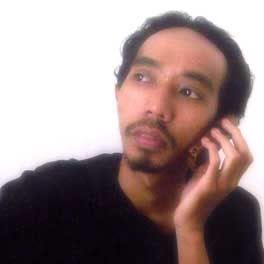
Membuat efek "glow" pada foto. Biasanya ini digunakan untuk membuat kesan glamour pada foto. Foto pada undangan manten itu loh..
Berikut ini adalah caranya:
1. Duplikat Background layer.
2. Aktifkan layer background copy, ubah blending option menjadi screen.
3. Beri Filter > Blur > Gaussian Blur. Atur sendiri nilainya sambil melihat gambar asli yang Anda edit.
Baca Selengkapnya..
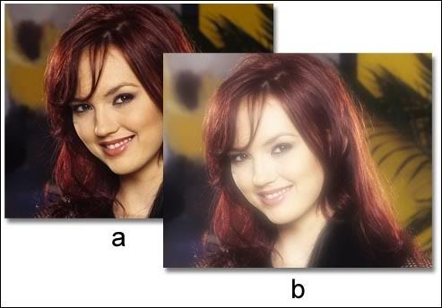 Contoh gambarnya
Senin, 29 Januari 2007
Create Glowing Effect Photo
Kamis, 25 Januari 2007
Maximazing Magnetic Lasso Tools
Magnetic Lasso tool is especially useful for quickly selecting objects with complex edges set against high-contrast backgrounds.
But to use Magnetic Lasso with it's great fuctionality, you need to do some things. When you have select it in the tool box, set any of this options in the option bar:
1. Specify feather, this option can be use to soften the edge of selestion.
2. Click anti-aliasing options, this will be use to smoth the edge of transition.
3. Specify Width amount, this is use to set distances from edge to consider as path. The Magnetic Lasso tool detects edges only within the specified distance from the pointer. I recommend to use small value, but it's actually depend on the image condition. There's a note in the end of this post that will help you to specify the value.
4. Specify Edges Contrast, to set contrast of edge to consider as path. A higher value detects only edges that contrast sharply with their surroundings; a lower value detects lower-contrast edges. I recommend to use small value, but it's actually depend on the image condition.
5. Frequency, use it to specify the amount of frequency at which points are added to the path. A higher value anchors the selection border in place more quickly.
6. Tablet pressure will only usable if you use a stylus tablet. When the option is selected, an increase in stylus pressure decreases the edge width.
Note:
- On an image with well-defined edges, try a higher width and higher edge contrast, and trace the border roughly. On an image with softer edges, try a lower width and lower edge contrast, and trace the border more precisely.
- While creating a selection, press the right bracket ( ] ) to increase the Magnetic Lasso edge width by 1 pixel; press the left bracket ( [ ) to decrease the width by 1 pixel.
- Press Delete key to go back to previous path point.
Baca Selengkapnya..
Selasa, 23 Januari 2007
How to make panoramic photo
 To make a panoramic picture, you need at least 2 pictures that will be assemble using photomerge. Be sure that all the photos are match when combined using photomerge.
Here's a few tips how to ensure you will get better result when taking a picture for photomerge. Because your source photographs play a large role in panoramic compositions.
a. Overlap images sufficiently Images should overlap by approximately 25% to 40%. If the overlap is less, Photomerge may not be able to automatically assemble the panorama. However, keep in mind that the images shouldn’t overlap too much. If images overlap by 70% or more, it can be difficult to work with them, and blending may not be as effective. Try to keep the individual photos at least somewhat distinct from each other.
b. Use a consistent focal length Avoid using the zoom feature of your camera while taking your pictures.
c. Keep the camera level Although Photomerge can process slight rotations between pictures, a tilt of more than a few degrees can result in errors when the panorama is assembled. Using a tripod with a rotating head helps maintain camera alignment and viewpoint. When photographing a panoramic scene from a high place, the natural inclination is to keep the horizon level in the viewfinder. However, this actually produces a noticeable rotation between images. Try using a tripod to keep the camera level when taking photographs in this situation.
d. Stay in the same position Try not to change your position as you take a series of photographs, so that the pictures are from the same viewpoint. Using the optical viewfinder with the camera held close to the eye helps keep the viewpoint consistent. Or try using a tripod to keep the camera in the same place.
e. Avoid using distortion lenses Fish-eye and other distortion lenses can interfere with Photomerge.
f. Maintain the same exposure Avoid using the flash in some pictures and not in others. The advanced blending feature in Photomerge helps smooth out different exposures, but extreme differences make alignment difficult. Some digital cameras change exposure settings automatically as you take pictures, so you may need to check your camera settings to be sure that all the images have the same exposure.
If you already have all the pictures, follow this step to make your panoramic photos:
1. Select File > Automate > Photomerge
2. In the Photomerge dialog box, click Browse to open all the file you want to merge. Select Attempt To Automatically Arrange Source Images if you want Photoshop to try to line the images up in their proper order. Deselect this option if you want to arrange the images in the lightbox yourself.
3. Click OK when you have open all the file.
4. Adjust image position by dragging or rotating it if necessary. If you want to save each image in the composition in individual layers, select Keep as Layers. (This is useful if you need to correct the color of each image separately.)
5. Click OK to get the photomerge result.
Note: You can use crop tool to cut the unwanted edge of the picture.
Baca Selengkapnya..
Print | Default Photo Size
This list contains the default photo size. For printing purpose, use 300 dpi.
3R = 8,89 x 12,7 cm = 3,5 x 5 inch
4R = 10,16 x 15,24 cm =4 x 6 inch
5R = 12,7 x 17,78 cm = 5 x 7 inch
8R = 20,32 x 25,4 cm = 8 x 10 inch
10R = 25,4 x 30,48 cm = 10 x 12 inch
12R = 30,48 x 39,37 cm = 12 x 15,5 inch
Baca Selengkapnya..
Senin, 22 Januari 2007
How to make Black and white photo by Using Channel Mixer
Here's how to make Black and white photo by Using Channel Mixer This has become the favorite of many professionals (and some will argue this is the absolute best way to create grayscale photos from color photos) because it lets you blend all three RGB channels to create a custom grayscale image. Here's how to do it:
- Open the color photo you want to convert to grayscale. Choose Channel Mixer from the Create New Adjustment Layer pop-up menu at the bottom of the Layers palette (it's the half black/half white circle icon). Channel Mixer is also found under the Image menu, under Adjustments; however, by applying it as an adjustment layer, you have the added flexibility of being able to edit your grayscale conversion later in your creative process, or to change your mind altogether and instantly return to a full-color photo.
- By default, the Channel Mixer is set to blend color RGB channels. When you're using this tool to create a grayscale image, you have to turn on the Monochrome checkbox at the bottom of the dialog to enable the blending of these channels as grayscale. You can then use the three color sliders to combine percentages of each channel to create your grayscale (black-and-white) photo.
- There was an old rule of thumb that your numbers had to equal 100%, but we've pretty much abandoned that (especially for printing to an ink printer). Now we just focus on how the print looks (not the numbers in the dialog), so feel free to push the numbers to create some nice contrast . When you click OK, the Channel Mixer is applied to your photo to create a black-and-white image.
- If you decide you want to edit your settings, just double-click on the Channel Mixer thumbnail (to the left of the layer mask) in the Layers palette. The Channel Mixer dialog will appear with the last settings you applied to your photo.
Baca Selengkapnya..
How to make Black and white photo
Here's how to make Black and white photo by Using Lightness Channel This is one of the most popular methods for converting from color to grayscale, as it lets you isolate just the luminosity in the photo, separating out the color; and by doing so, you often end up with a pretty good grayscale image. However, since this uses the Lightness channel, we also add one little twist that lets you "dial in" a perfect grayscale photo almost every time. The most important thing for you to do in this chapter is to try all the different grayscale methods to decide which one you like best.
- Open the color RGB photo that you want to convert to grayscale using the Lightness channel method.
- Go under the Image > Mode > Lab Color to convert your RGB photo into Lab Color mode. You won't see a visual difference between the RGB photo and the Lab Color photo the difference is in the channels that make up your color photo.
- Go to the Channels palette (Window > Channel), and you'll see that your photo is no longer made up of a Red, a Green, and a Blue channel. Instead, the luminosity (the Lightness channel) has been separated from the color data, which now resides in two channels named "a" and "b."
- We're interested in the grayscale image that appears in the Lightness channel, so click on the Lightness channel in the Channels palette to make it active. Your photo will now look grayscale onscreen too, as it displays the currently active channel.
- Now, go under the Image menu, under Mode, and choose Grayscale. Photoshop will ask if you want to discard the other channels. Click OK. If you look in the Channels palette, you'll now see only a Gray channel.
- Go to the Layers palette, click on the Background layer, and then press Control+J to duplicate the Background layer. Take a look at your image now. If it looks a little too dark, switch the layer blend mode of this duplicated layer from Normal to Screen, and you'll see the photo become much lighter. If the photo looks too light, choose Multiply as your blend mode instead. In the example shown here, changing the top layer to Screen made the photo too light, but don't sweat itthat's just a starting point.
- This is where you get to "dial in" your ideal tone (and fix that "too-light" look from the Screen layer). Just lower the Opacity of your layer in the Layers palette until you have the tonal balance you've been looking for. Using the Lab Color method gives you much more control and depth than just choosing the Grayscale mode from the Image > Mode. You can change it into RGB channel again if you want (select Image > Mode > RGB).
Baca Selengkapnya..
Minggu, 21 Januari 2007
Old Photo's Effects
To make a digital photos or image looks old, you can make it black and white or by turn them into sephia's effect. Here's how to do it:
1. Adjust the image color.
- select Image > Adjustment > Hue/Saturation
- click Colorize option in the lower right of the dialog box
- adjust Hue = 30, Saturation = 25, Lightness = 0
2. Apply noise to the image by select Filter > Add Noise. You can experiment with the noise amount or distribution.
3. To make a white border, press D to reset the background color. Duplicate the layer, and make it a litle smaller than the original layer. Delete the original layer, and select Layer > Layer Style > Stroke to make a black line around the image.
Creating Silhouette Photos
 Here how to make a silhouette image:
1. Make selection on the object you want.
2. Copy and paste it.
3. Right click in the layer thumbnals, select Select Layer Tranparency.
4. Press D to reset the color. Then press Alt + Backspace to make it Black.. Deselect the selection. This will make the object look dark. You can try different way to make the object look dark.
5. Try to make the background layer look dark, by Alt + Backspace, or use other image as background. Apply a filter like Lighting Effect of Lens Flare on the background layer to make a dramatic effects.
Membuat seleksi dengan path
Sebuah cara yang efektif untuk membuat seleksi pada photoshop adalah dengan menggunakan path. Path yang dimaksudkan disini adalah sebuah garis yang dibentuk dengan pen tool, atau sebenarnya bisa juga dibuat dengan memanfaatkan seleksi yang sudah ada. Kalau mengubah dari seleksi yang sudah ada, relatif lebih sulit, karena pasti ngedit per titiknya akan lebih banyak.
Berikut ini cara untuk membuat seleksi dengan path pada photosop: Buat gambar garis path seperti garis seleksi yang akan dibuat. Tiap klik akan membuat sebuah garis bersambung, jika ingin garis yang melengkung, klik-nya ditahan sambil digeser mouse-nya.
Harap diingat bahwa untuk membuat path pada photoshop sebagaio seleksi, path yang ada hanya ada satu. Karena bila dibuat path yang baru, maka path ini akan menghapus path yang terdahulu. Jika menginginkan ada lebih dari 1 path, maka buat dulu path yang baru dari menu Window > Path untuk menampilkan palet path. Buatlah path yang baru dari palet ini.
Path untuk membuat seleksi ini hanya efektif pada seleksi pada bidang/gambar yang pinggirannya solid, tidak efektif jika tepian seleksi yang akan dibuat berbentuk halus atau abstrak, misalnya menyeleksi rambut, bulu, asap, atau yang lainnya.
Baca Selengkapnya..
Kamis, 18 Januari 2007
Photoshop Easter Egg
Easter Eggs adalah hal-hal unik dan biasanya lucu yang tersembunyi pada sebuah program.
Splash Screen Rahasia pada Photoshop Untuk memunculkan splash screen rahasia, tekan dan tahan tombol Ctrl, kemudian pilih menu Help > About Photoshop.
Merlin Lives Untuk memunculkan sebuah palette dengan gambar Merlin, aktifkan/tampilkan palet Paths, kemudian tekan dan tahan Alt sambil memilih Pallete Options pada menu palet.
Baca Selengkapnya..
Photoshop Troubleshutting
Getting problem with "Undo"?
There's just 1 undo in Photoshop, if you want to do multiple undo, just choose Edit > Step Backward or by pressing Ctrl+Alt+Z. This will give you up to 20 steps. You can raise this number of step by making adjustment in Edit > Preferences > General. Raise the history States (default is 20).
Bermasalah dengan "Undo"?---------------------------------------------------------
Dalam Photoshop hanya ada satu Undo, jadi jika Anda menginginkan Undo dalam jumlah banyak, Anda bisa menggunakan menu Edit > Step Backward atau dengan menekan Ctrl+Alt+Z. Ini akan memberikan Anda hingga 20 langkah undo. Jika Anda menginginkan lebih lagi, bisa Anda atur sendiri jumlah undo-nya, dengan cara memilih menu Edit > Preferences > General. Tingkatkan nilai pada History states (nilai default-nya adalah 20).
Missing Brush Diameters
When using Brush Tools or other tools, after a while, sometime the pointer doesn't show it's diameter. This can be happen if the Capslock key if active, try to press the Capslock key to turn it off. If this not solve the problem, save all your work, and then reset your PC.
------------------------------------------------------
Diameter Brush yang menghilang
Saat menggunakan Brush Tools, atau tools lain, setelah beberapa lama digunakan, pointer tidak menampilkan ukuran diameter. Ini bisa diatasi dengan menonaftifkan tombol Capslock. Jika ini tidak mengatasi masalahnya, maka simpan semua pekerjaan Anda kemudian restart komputer Anda.
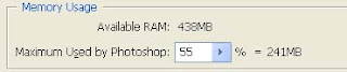
Getting problem with slow Photoshop
First, check out your RAM. Not sure if you have enough RAM? Just ask Photoshop. Believe it or not, it can tell you. Here's how: Open a document that's indicative of the type of image you normally work on. Work on the image, doing typical stuff, for about 10 minutes. In the bottom left-hand corner of your document window, just to the right of the current document magnification readout, is the Info box. By default, it's set to display your document's file size, but if you click-and-hold on the right-facing triangle to the right of it, a pop-up list of options will appear. Choose Efficiency. If the percentage shown is 100%, it's good. That means that Photoshop is running at peak efficiency, because 100% of the time your image manipulations are being handled in RAM. If the efficiency number shown is,say, 75%, this means that 25% of the time, Photoshop ran out of RAM and had to use free hard drive space to make up for it, which means Photoshop ran much slower 25% of the time. An efficiency of 75% is pretty much as low as you want it to go. If it shows anything less than 75%, it's time to buy more RAM.
Or you can try this one first.
Check out Photoshop memory usage, you can do it by select Edit > Preferences > Image & Memory Usage.
 Adding RAM doesn't always make Photoshop run faster. It only works if you didn't have enough RAM to begin with. Adding RAM will only help to make your computer run as fast as it can, but it won't make your 800-MHz computer run at 801 MHz. For example, if you work on Web images and the average image you work on is 3 MB, you only need about 15 or 20 MB assigned to Photoshop to have it run at full speed. If you've got that, and add another 256 MB of RAM, Photoshop won't run any faster, because Photoshop only needs that 15 or 20 MB that you already had.
Baca Selengkapnya..
------------------------------------------------------
Diameter Brush yang menghilang
Saat menggunakan Brush Tools, atau tools lain, setelah beberapa lama digunakan, pointer tidak menampilkan ukuran diameter. Ini bisa diatasi dengan menonaftifkan tombol Capslock. Jika ini tidak mengatasi masalahnya, maka simpan semua pekerjaan Anda kemudian restart komputer Anda.
Getting problem with slow Photoshop
First, check out your RAM. Not sure if you have enough RAM? Just ask Photoshop. Believe it or not, it can tell you. Here's how: Open a document that's indicative of the type of image you normally work on. Work on the image, doing typical stuff, for about 10 minutes. In the bottom left-hand corner of your document window, just to the right of the current document magnification readout, is the Info box. By default, it's set to display your document's file size, but if you click-and-hold on the right-facing triangle to the right of it, a pop-up list of options will appear. Choose Efficiency. If the percentage shown is 100%, it's good. That means that Photoshop is running at peak efficiency, because 100% of the time your image manipulations are being handled in RAM. If the efficiency number shown is,say, 75%, this means that 25% of the time, Photoshop ran out of RAM and had to use free hard drive space to make up for it, which means Photoshop ran much slower 25% of the time. An efficiency of 75% is pretty much as low as you want it to go. If it shows anything less than 75%, it's time to buy more RAM.
Or you can try this one first.
Check out Photoshop memory usage, you can do it by select Edit > Preferences > Image & Memory Usage.
 Adding RAM doesn't always make Photoshop run faster. It only works if you didn't have enough RAM to begin with. Adding RAM will only help to make your computer run as fast as it can, but it won't make your 800-MHz computer run at 801 MHz. For example, if you work on Web images and the average image you work on is 3 MB, you only need about 15 or 20 MB assigned to Photoshop to have it run at full speed. If you've got that, and add another 256 MB of RAM, Photoshop won't run any faster, because Photoshop only needs that 15 or 20 MB that you already had.
How to soften the selections edges
Jika anda pernah menggunakan magic wand, lasso, ataupun selections tools lainnya untuk membuat seleksi pada foto dengan Photoshop, tentu akan mendapatkan sebuah tepian seleksi yang bergerigi. Tepian seleksi ini bisa diperhalus. Pada CorelPhotopaint, ini dapat diminimalir dengan memberikan Feather pada seleksi. Namun pada Photoshop untuk memberikan Feather tidak langsung mendapatkan previewnya, sehingga relatif lebih sulit dilakukan. Berikut ini adalah cara untuk memperhalus tepian seleksi pada photoshop:
- Pastikan layer yang Anda seleksi dalam keadaan aktif, dan bukan merupakan layer background.
- Klik icon Add Layer Mask pada palet layer.
- Pilihlah menu Filter > Blur > Gaussian Blur. Tentukan seberapa banyak tingkat kehalusan gambar yang Anda inginkan.
- Jika tepian halus yang Anda inginkan hanya pada perbagian dari gambar, maka gunakanlah Blur Tool untuk membuat kesan halus tersebut.
Mudah kan?
Photoshops Defaults Keyboard Shortcuts
This is Photoshops defaults keyboard shortcuts that will help you to improve your speed when using photoshop. Use notepad to read it, because it’s to large to fit here.
Result Windows Mac OS
————————————————————————————————————————————————————————
Cycle through tools with the same shortcut key Shift-press shortcut key Shift-press shortcut key
(*when Use Shift Key for (*when Use Shift Key for
Tool Switch preference Tool Switch preference
is disabled) is disabled)
————————————————————————————————————————————————————————-
Cycle through hidden tools Alt-click + tool (*except add Option-click + tool (*except add
anchor point, delete anchor anchor point, delete anchor
point, and convert point tools) point, and convert point tools)
————————————————————————————————————————————————————————
Rectangular Marquee tool M M
Rounded Rectangle Marquee tool M M
Elliptical Marquee tool M M
Single Row Marquee tool M M
Single Column Marquee tool M M
————————————————————————————————————————————————————————–
Move tool V V
————————————————————————————————————————————————————————–
Lasso tool L L
Polygonal Lasso tool L L
Magnetic Lasso tool L L
————————————————————————————————————————————————————————–
Magic Wand tool W W
————————————————————————————————————————————————————————–
Crop tool C C
————————————————————————————————————————————————————————–
Slice tool K K
Slice Select tool K K
————————————————————————————————————————————————————————–
Spot Healing Brush tool J J
Healing Brush tool J J
Patch tool J J
Red Eye tool J J
————————————————————————————————————————————————————————–
Brush tool B B
Pencil tool B B
Color Replacement tool B B
————————————————————————————————————————————————————————–
Clone Stamp tool S S
Pattern Stamp tool S S
————————————————————————————————————————————————————————–
History Brush tool Y Y
Art History Brush tool Y Y
————————————————————————————————————————————————————————–
Eraser tool E E
Background Eraser tool E E
Magic Eraser tool E E
Paint Bucket tool G G
————————————————————————————————————————————————————————–
Blur tool R R
Sharpen tool R R
Smudge tool R R
————————————————————————————————————————————————————————–
Dodge tool O O
Burn tool O O
Sponge tool O O
————————————————————————————————————————————————————————–
Path Selection tool A A
Direct Selection tool A A
————————————————————————————————————————————————————————–
Horizontal Type tool T T
Vertical Type tool T T
Horizontal Type mask tool T T
Vertical Type mask tool T T
————————————————————————————————————————————————————————–
Pen tool P P
Freeform Pen tool P P
————————————————————————————————————————————————————————–
Rectangle tool U U
Rounded Rectangle tool U U
Ellipse tool U U
Polygon tool U U
Line tool U U
Custom Shape tool U U
————————————————————————————————————————————————————————–
Notes tool N N
Audio Annotation tool N N
————————————————————————————————————————————————————————–
Eyedropper tool I I
Color Sampler tool I I
Measure tool I I
————————————————————————————————————————————————————————–
Hand tool H H
————————————————————————————————————————————————————————–
Zoom tool Z Z
————————————————————————————————————————————————————————–
Rectangle Image Map tool P P
Circle Image Map tool P P
Polygon Image Map tool P P
————————————————————————————————————————————————————————–
Image Map Select tool J J
————————————————————————————————————————————————————————–
Tab Rectangle tool R R
Pill Rectangle tool R R
—————————————————————————————————————— Baca Selengkapnya..
Senin, 15 Januari 2007
Seleksi dengan Channel
 There's another way to create selections. It mostly being used, when selecting a part of hair, smoke, or another transparants objects. As we all know, it's very difficult to make selection for that objects by using regular Selection Tools (such Marque, Lasso, Magic Wand Tools).
But it's still can be done by using combination of Channel and Layer Mask, as follow:
1. Make sure the layer you are working on is not a background layer. If it's Background, double click on it and then press OK.
2. On Channel Palette, select channel which you think the most contrast. Duplicate it.
3. Make the image on that duplicated channel is black and white. Which black area means it will not being selected, and white will be selected. If it's necessary, it can be adjusted by select Image > Adjustment > Invert.
4. Make that image completely black and white. You can use Brush Tools, and Burn / Sponge Tools by selectively choosing the right color range to adjust the black or white area.
5. After the image is completely black and white, klik the icon Load Channel as Selection.
6. The selection is done, you can return to RGB Channel.
Baca Selengkapnya..
Calibrating and profiling your monitor
 When you calibrate your monitor, you are adjusting it so it conforms to a known specification. Once your monitor is calibrated, the profiling utility lets you save a color profile. The profile describes the color behavior of the monitor—what colors can or cannot be displayed on the monitor and how the numeric color values in an image must be converted so that colors are displayed accurately.
1. Make sure your monitor has been turned on for at least a half hour. This gives it sufficient time to warm up and produce more consistent output.
2. Make sure your monitor is displaying thousands of colors or more. Ideally, make sure it is displaying millions of colors or 24-bit or higher.
3. Remove colorful background patterns on your monitor desktop and set your desktop to display neutral grays. Busy patterns or bright colors surrounding a document interfere with accurate color perception.
4. Do one of the following to calibrate and profile your monitor:
• In Windows, use the Adobe Gamma utility, located in the Control Panel.
• In Mac OS, use the Calibrate utility, located in the System Preferences/Displays/Color tab.
• For the best results, use third-party software and measuring devices. In general, using a measuring device such as a colorimeter along with software can create more accurate profiles because an instrument can measure the colors displayed on a monitor far more accurately than the human eye.
Note: Monitor performance changes and declines over time; recalibrate and profile your monitor every month or so. If you find it difficult or impossible to calibrate your monitor to a standard, it may be too old and faded.
Langkah-langkah mengkalibrasi monitor
Berikut ini adalah langkah-langkah untuk mengkalibrasi monitor:
1. Pastikan monitor sudah dihidupkan paling tidak setengah jam. Atur juga penerangan di ruang yang Anda gunakan)
2. Tampilkan warna monitor Anda dalam 24 bit atau lebih (gunakan Display Properties untuk mengaturnya).
3. Ubah gambar background/wallpaper dengan warna abu-abu (atur dari Display Properties).
4. Gunakan software Adobe Gamma (ada di Control Panel). Ikuti langkah-langkahnya pada program tersebut.
Setelah dikalibrasi, maka akan dibuatkan sebuah profile yang bisa Anda simpan. Usahakan untuk mengkalibrasi monitor secara berkala.
How to calibrate monitor by using Adobe Gamma

Adobe Gamma is a profiling software that can both calibrate and characterize your monitor. Calibrating your monitor brings it into compliance with a predefined standard; for example, adjusting your monitor so that it displays color using the graphics arts standard white point color temperature of 5000 degrees Kelvin. Characterizing your monitor simply creates a profile that describes how the monitor is currently reproducing color.
Monitor calibration involves adjusting the following video settings:
Brightness and contrast The overall level and range, respectively, of display intensity. These parameters work just as they do on a television. Adobe Gamma helps you set an optimum brightness and contrast range for calibration.
Gamma. The brightness of the midtone values. The values produced by a monitor from black to white are nonlinear—if you graph the values, they form a curve, not a straight line. Gamma defines the value of that curve halfway between black and white.
Phosphors. The substances that CRT monitors use to emit light. Different phosphors have different color characteristics.
White point. The color and intensity of the brightest white the monitor can reproduce.
Kalibrasi monitor dengan Adobe Gamma
Adobe Gamma merupakan program yang dapat digunakan untuk mengkalibrasi monitor, program ini biasanya sudah disertakan saat Anda menginstall Adobe Photoshop. Kalibrasi disini maksudnya adalah membuat agar monitor agar mampu menampilkan warna yang standar.
Setting monitor yang diatur pada saat mengkalibrasi monitor adalah sebagai berikut:
Brightness and Contrast, pengaturannya seperti pada televisi, yang tentu sudah biasa Anda lakukan. Program ini akan mengatur Brightness dan Contrast agar bisa optimal.
Gamma, merupakan pengaturan nilai range warna midtones.
Phosphors, merupakan substansi yang digunakan oleh monitor CRT.
White Point, menentukan intensitas terang warna putih.
Baca Selengkapnya..
Monitor calibration involves adjusting the following video settings:
Brightness and contrast The overall level and range, respectively, of display intensity. These parameters work just as they do on a television. Adobe Gamma helps you set an optimum brightness and contrast range for calibration.
Gamma. The brightness of the midtone values. The values produced by a monitor from black to white are nonlinear—if you graph the values, they form a curve, not a straight line. Gamma defines the value of that curve halfway between black and white.
Phosphors. The substances that CRT monitors use to emit light. Different phosphors have different color characteristics.
White point. The color and intensity of the brightest white the monitor can reproduce.
Kalibrasi monitor dengan Adobe Gamma
Adobe Gamma merupakan program yang dapat digunakan untuk mengkalibrasi monitor, program ini biasanya sudah disertakan saat Anda menginstall Adobe Photoshop. Kalibrasi disini maksudnya adalah membuat agar monitor agar mampu menampilkan warna yang standar.
Setting monitor yang diatur pada saat mengkalibrasi monitor adalah sebagai berikut:
Brightness and Contrast, pengaturannya seperti pada televisi, yang tentu sudah biasa Anda lakukan. Program ini akan mengatur Brightness dan Contrast agar bisa optimal.
Gamma, merupakan pengaturan nilai range warna midtones.
Phosphors, merupakan substansi yang digunakan oleh monitor CRT.
White Point, menentukan intensitas terang warna putih.
Langganan:
Postingan (Atom)